In a world saturated with information and complex visual stimuli, the quest for clarity and simplicity in design remains remarkably potent. Few objects epitomize this pursuit better than the iconic Swiss Federal Railways (SBB) clock, a masterclass in functional elegance that has graced Swiss train stations for decades. While this specific clock was the brainchild of Hans Hilfiker, its design principles resonate deeply with the work of another Swiss design luminary, Max Bill. A product of the Bauhaus movement, Bill championed a philosophy of minimalist, highly functional design that found expression in his own influential watch creations. Together, the stark legibility of the SBB clock and the refined simplicity of Max Bill’s horological designs have cast a long shadow, profoundly shaping not only modern watch aesthetics but also the visual language of our digital interfaces, most notably finding a distinct echo in the Apple Watch.
The Bauhaus Foundation: Max Bill’s Design Philosophy
To understand the enduring impact of Max Bill (1908-1994) on design, one must look to his education and an unwavering commitment to the Bauhaus philosophy. Founded by Walter Gropius in 1919, the Bauhaus school sought to unify art, craftsmanship, and technology, advocating that form should follow function. Bill studied at the Bauhaus in Dessau from 1927 to 1929, absorbing its principles of rational design, geometric abstraction, and the creation of objects that were both aesthetically pleasing and perfectly suited to their purpose.
Throughout his multifaceted career – spanning architecture, painting, sculpture, typography, graphic design, and industrial design – Bill remained a fervent advocate for “Die gute Form” (Good Form). He believed in design that was unpretentious, honest in its use of materials, and universally understandable. For Bill, beauty was not a superficial embellishment but an inherent quality of well-considered, functional design. This ethos would become particularly evident in his horological work.
An Emblem of Punctuality: The Swiss Federal Railways (SBB) Clock
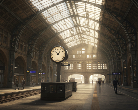
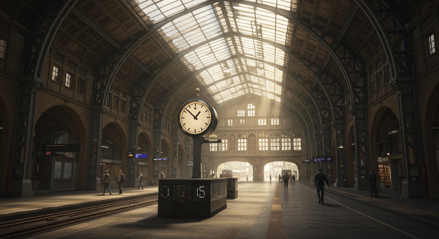
While Max Bill was forging his path in modernist design, another significant piece of Swiss design history was being created. In 1944, Hans Hilfiker (1901-1993), an engineer and designer employed by the Swiss Federal Railways, designed the iconic station clock. Its primary objective was absolute clarity and precision, essential for a nation renowned for its punctuality.
The SBB clock face is a marvel of reductive design:
- High Contrast: Bold, black bar markers on a clean white background ensure maximum legibility from a distance.
- Minimalist Hands: Simple, black baton-style hour and minute hands.
- The Red Seconds Hand: Perhaps its most distinctive feature is the bright red seconds hand, shaped like a railway guard’s signaling disc (the “rote Kelle”). This not only adds a striking visual accent but also serves a unique technical function.
The genius of Hilfiker’s design extended to its operation. The seconds hand completes its rotation in approximately 58.5 seconds and then briefly pauses at the 12 o’clock position. During this pause, it receives an electrical impulse from a central master clock, which also signals the minute hand to advance crisply to the next minute. This ingenious system ensured that all station clocks across the SBB network were perfectly synchronized, facilitating the famously precise departure of Swiss trains. The SBB clock quickly became a beloved national symbol, an emblem of Swiss efficiency and design prowess.
Max Bill’s Horological Masterpieces for Junghans
In the late 1950s, Max Bill began a fruitful collaboration with the German watch and clock manufacturer Junghans. Tasked with designing a kitchen clock, Bill applied his rigorous Bauhaus principles, resulting in a device of remarkable clarity and utility, featuring a distinctive timer. This success led to a series of wristwatches, first released in 1961, which are now considered classics of 20th-century watch design.
The Junghans Max Bill watches are characterized by:
- Uncluttered Dials: Domed dials with minimal markings, often featuring custom-designed, slender sans-serif numerals (or sometimes no numerals at all, just precise minute markers).
- Harmonious Proportions: A careful balance between the case size, dial, hands, and markers, creating an overall sense of visual harmony.
- Functional Elegance: Slender hands and discreet date windows (on some models) that integrate seamlessly without disrupting the dial’s purity.
These watches, while distinct from Hilfiker’s SBB clock, share a profound spiritual kinship. Both prioritize legibility and functionalism, eschewing ornamentation in favor of pure, purposeful design. They demonstrate that thoughtful reduction can lead to a more powerful and lasting aesthetic.
The Enduring Power of Simplicity
The enduring appeal of both the SBB clock and Max Bill’s watch designs lies in their masterful execution of simplicity. In a world of fleeting trends, their clean lines and focus on essential function provide a sense of order and calm. This aesthetic is not about being stark or empty, but about achieving a sophisticated clarity where every element has a purpose and contributes to the overall legibility and visual balance. Such designs possess a lasting quality precisely because they are not tied to a specific fad but are rooted in fundamental principles of good design: readability, usability, and an inherent aesthetic rightness.
From Swiss Stations to Smart Screens: A Legacy in the Digital Age
The influence of this Swiss design tradition, particularly the SBB clock’s striking visual identity, has extended far beyond station platforms and mechanical watches.
In 1986, the Swiss watch company Mondaine obtained the official license from SBB to produce wristwatches and clocks featuring Hilfiker’s iconic dial. This move brought the SBB clock design to a global consumer audience, further cementing its status as a design classic.
More recently, and perhaps most notably, this design language found its way onto millions of smartphone and smartwatch screens. In 2012, Apple introduced a clock app in its iOS 6 operating system that bore an unmistakable resemblance to the SBB clock face. This led to a swift, amicable agreement where Apple licensed the design from SBB, acknowledging its distinctiveness.
The Apple Watch, launched a few years later, continued to embrace this heritage of clarity. Several of its available analogue clock faces draw inspiration from this minimalist, highly legible tradition. Whether it’s the “Simple” face with its clean lines and customizable complications, or other designs that prioritize instant readability, the influence of mid-century modernist principles – championed by figures like Bill and exemplified by Hilfiker’s clock – is evident. Apple’s broader design philosophy, often centered on intuitive user experience and an uncluttered aesthetic, aligns well with these enduring design values. The success of these analogue-inspired faces on a high-tech digital device underscores the universal appeal of well-executed simplicity.
More Than Just Telling Time: A Universal Design Language
The legacy of the SBB clock and Max Bill’s design philosophy teaches us that true modernism is not about a specific style, but about an approach: a commitment to clarity, functionality, and thoughtful reduction. These designs are not merely instruments for telling time; they are examples of effective visual communication. The principles they embody – high contrast, clear hierarchy of information, and freedom from unnecessary embellishment – are just as relevant for designing a website homepage or a mobile application interface as they are for a watch dial.
In conclusion, the journey of these design principles, from the bustling train stations of Switzerland and the meticulous drawing boards of Bauhaus-influenced designers like Max Bill, to the digital screens of our Apple Watches and other devices, is a powerful testament to their lasting relevance. The unwavering focus on clarity and functional elegance ensures that these designs continue to inform and inspire, proving that a commitment to fundamental design virtues can create objects and interfaces that remain compelling and useful across generations and technological shifts.